I had 3 players test my game. One of them was my sister, one of them was my mother, and the last was a friend of mine who I sent the package to named Angel. I created this game with the assignment goal in mind, and attempted to create a map which taught the players the basic controls, enemies, and aspects of a theoretical game. I had the players test my game with a keyboard and mouse.
First, the players said my placement of the checkpoints was okay, but the checkpoints need to be marked as such. The players all asked me what the small crystals on the ground were, and I realized that nothing about the checkpoints made them seem as such. The players expressed that the general enemy location was good, and the ideas behind their placement were solid.
What went wrong?

What went wrong?
I received lots of feedback on my level and realized it would need lots of improvements to become a fun level. First, the players noticed that the level is far too large in scale in some sections, with some rooms being so large that enemy fights are a breeze, and that crossing said rooms just takes longer than necessary. This was 100% an error on my part, as I did not properly create the level to make the rooms convenient and fun, instead focusing on recreating the original concept. The players expressed that this is a prevalent problem throughout the level, with many areas having easily-skippable enemies. My friend Angel also added that the level generally has very little direction. However, I will cover this more in-depth later during the flow and critical path sections. Finally, the players unanimously recommended that I add more player interactables, as the player only really uses a few door switches throughout, when there is potential for more player engagement in the level.

How might you improve your level next time?
Next time, I plan to compress my level in the major boss rooms. I also plan to add more elements such as text to display to the player aspects of the level such as the door keys and the checkpoints. I plan to add more player interactivity to my level, as the level was not very engaging, and only really had players killing monsters and opening simple doors. I plan to change some areas to add enemies, as there were a few areas where the difficulty was insultingly easy, even for a tutorial. Next, I plan to add a section which teaches players to use switches and pressure plates to the level.


Were the challenges presented appropriate to the skill level of the player?
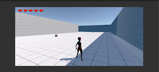
No. The level is extremely easy due to the combat arenas being far too large and allowing for easy fights. I also did not have very many enemies in certain areas where I could have, and overall the level is a little too easy in both my opinion and the opinions of my players.
Was the critical path obvious?
The critical path was average in terms of how obvious it was. Players walked around confused in some areas, while understanding exactly where to go in other areas. Nothing in the level explains how the doors work, which i a crucial part of the level, and nothing explains to the player where they are supposed to go. At the same time, I did not design the level well enough to indicate this to the player without telling them outright.
How was the overall flow?
The overall flow was weak. While the direction of the flow was good, the flow itself was abruptly stopped at times when the players had to figure out the doors and how to progress. The level barely felt like a level, and more like a "poorly-designed puzzle" according to my friend Angel.
Were there circulation elements?
Yes. However, I feel like I must add more to the level. I added doors of different colors to catch the players' eye, but the doors felt out of place and awkward because they had no visual to explain them, and no inner monologue from the character to help the player understand their objective an where to go.
Comments
Post a Comment